Persistency output
Persistency analysis output options involve
- The percentage of the time covered by sufficiently long windows
- The number of sufficiently long windows
- The delay waiting for sufficiently long windows
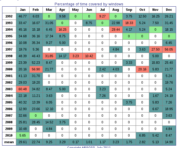
The percentage of the time output option provides a table and a plot similar to the ones below
The table above shows the percentage of time covered by sufficiently long windows for each month (columns) and for each year analysed (rows), including the monthly mean taken over all years (extra row).
Colors indicate the highest entry for a month (salmon) as well as the lowest (light green).
Non-zero entries are green. White indicates 'real' zeros.
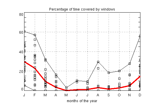
Monthly means (thick red line) and the interannual variation of the percentage of time covered by windows are plotted above.
The thin black lines indicate the extremes and the black markers represent the values found for each year analysed for a particular month.
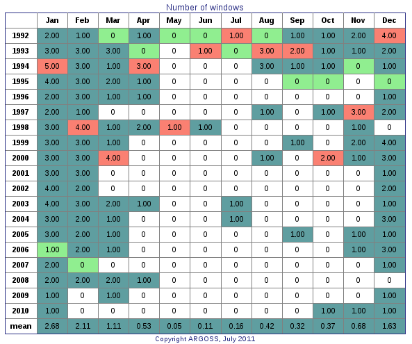
The number of windows output option yields a table and a plot similar to the ones below
The table above shows the number of sufficiently long windows for each month (columns) and for each year analysed (rows), including the monthly mean taken over all years (extra row).
Colors indicate the highest entry for a month (salmon) as well as the lowest (light green).
Non-zero entries are green. White indicates 'real' zeros.
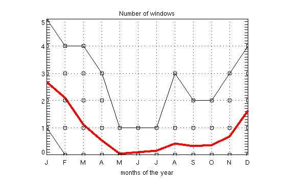
Monthly means (thick red line) and the interannual variation of the number of windows are plotted above.
The thin black lines indicate the extremes and the black markers represent the values found for each year analysed for a particular month.
Mean delay is defined as the mean duration between all model-dates in a particular month and the
start of the next sufficiently long window in the current month or in the next month.
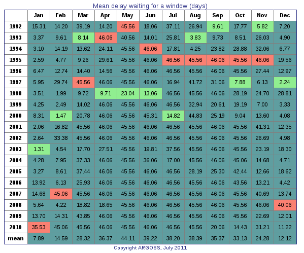
This output option results in a table and a plot similar to the ones below
The table above shows the mean delay (days) waiting for the next sufficiently long window for each month (columns) and for each year analysed (rows), including the monthly mean taken over all years (extra row).
Colors indicate the highest entry for a month (salmon) as well as the lowest (light green).
Non-zero entries are green. White indicates 'real' zeros.
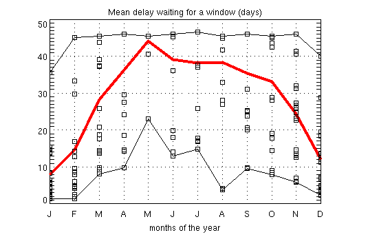
Monthly means (thick red line) and the interannual variation of the delay waiting for windows are plotted above.
The thin black lines indicate the extremes and the black markers represent the values found for each year analysed for a particular month.
In case all sea states are approved (no limits in effect), the percentage
of time covered by windows should be a 100 percent for each month.
However, this is not exactly true for the last December month analyzed due
to the fact that data stops at one model time step before the end of the last year in the database e.g. December 31 2010 at 21:00.
Consequently, the fraction of time covered by windows in December of the last year analyzed is
100*(1-3/(31*24))=99.60 percent.
Please be aware of the fact that the mean delay for the month December of the last year analyzed might deviate from the delays in the month
December of the other years due to the fact that the end of the database is reached: there is no next month.
This becomes most apparent if very few or no windows are found.
Tip:
Logon as demo (no password needed) to get acquainted with the different types of output without being charged.