Monthly statistics
A distribution over the months of the year can either be tabulated or plotted.
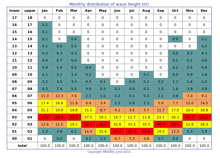
The monthly distribution table gives the relative distribution of wave height or wind speed over all months of the year: January until December. Each table entry contains the percentage or the absolute number of samples falling inside the related wave heigth or wind speed class. Colors indicate the highest entries: the red cells show the modus for each month. Per month, the second and third highest cells are yellow and the fourth and fifth highest cells are orange. White means 'really' zero.
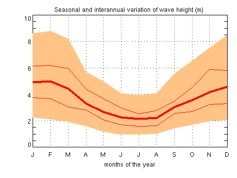
The seasonality plot shows the monthly averages (thick red line) of wave height or wind speed against the months of the year. Interannual variation is indicated by the minimum and maximum monthly average over the years (thin red lines). In addition, the 90% confidence interval for the values in a particular month (orange) is given.
Tip:
Logon as demo (no password needed) to get acquainted with the different types of output without being charged.
Tip: Use preferences to tailor the output to your needs (under Account in the upper right menu) .